If you’re just interested in the finished product, you can jump to the end.
Background
In late April of this year, Virginia voters passed proposition 21. This would have allowed the state legislature to temporarily redistrict Virginia to try and counteract gerrymandering taking place elsewhere in the US.1 At the time I created a small visualization that I wasn’t entirely happy with, so I took it a step further and made it interactive. This blog post will describe a little bit of the original process and how I built another visualization that I’m a little happier with.
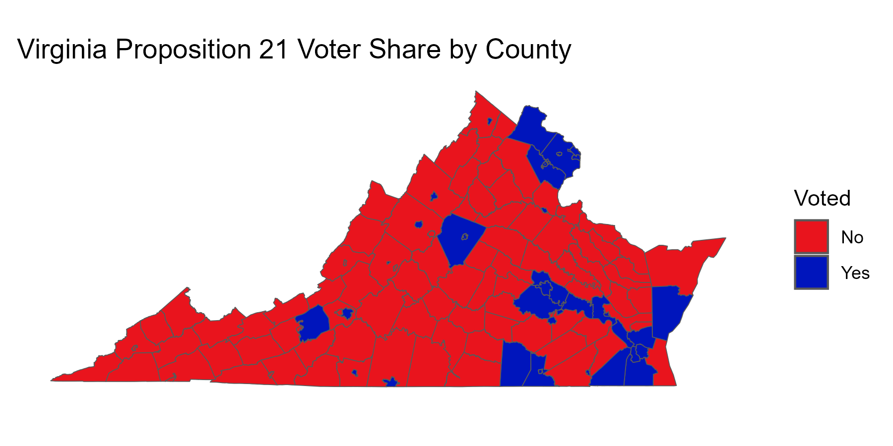
For context: When discussing voter share on issues, you sometimes see maps like the one below discussed.
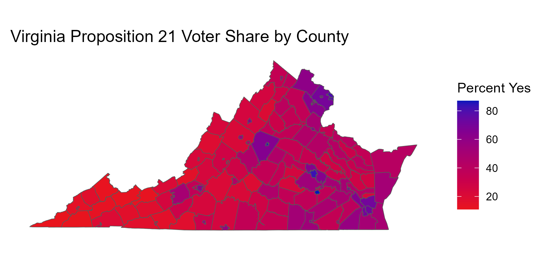
You might look at this and think that most of the state votes against the proposition. However, this isn’t a one-county-one-vote situation, every person gets one vote. There wasn’t any county where everyone voted for or against prop 21, just counties that were more or less in favor of the proposition as a proportion of their voters. Turning the vote percentages into a color gradient and I have something a little more instructive.
This gives us a better sense of the reality, that this was a situation where the state was “purple”, with 51.69% of voters in favor and 48.31% against. However, the remaining problem with this map is that land doesn’t vote. People vote. People mostly live in cities, and this visualization doesn’t account for differences in population density. The usual solution to this situation is a cartogram. Cartograms distort the existing map projections in some way to help represent something like population density.
Getting the data
The first thing I need to do to make a cartogram is to retrieve my data. The underlying data for my visualizations came from a few places. First, I retrieved the vote counts in the form of a JSON file from the Virginia Department of Elections (here). Then I looked around for a while for a shapefile for Virginia that included the counties. Shapefiles are special files for building maps that contain information about geographic boundaries. I finally landed on one from the VA Department of Emergency Management (here). This is the data I used to produce the first map, above. Then I went and looked for some population estimates. At the time, the best ones I could find were from the Cooper Center at University of Virginia for July 1, 2025 (here). They haven’t yet posted an update. I assume one is coming, but these numbers are good enough. Now, I read them into R and do a little bit of mucking about. This includes the fact that reading the JSON file in as a tibble includes data that’s multiply-nested, which requires me to unnest a couple times and do some manipulation.
Click to see R
library(jsonlite) #for reading JSON fileslibrary(tidyverse) #general data transformationlibrary(sf) #R package for manipulation of shape files and simple features objectslibrary(cartogram) #R package for creating cartograms#downloaded from VA Department of Electionslocaldat <-fromJSON("export-2026-April-21-Special.json")localresults <-as_tibble(localdat$localResults) |>unnest(cols = ballotItems, names_repair ="unique") |>#The nested data has some repeat column namesrename(id =`id...1`, name =`name...2`) |>#fix a couple of the namesunnest(cols = ballotOptions, names_sep ="_") |>#the actual vote vote counts are nested in ballotOptions select(id, name, YN = ballotOptions_name, voteCount = ballotOptions_voteCount) |>#really only need a a few columnspivot_wider(names_from = YN, values_from = voteCount) |>#Unnest gives two rows for each county, so I use pivot_wider to get a single row per countymutate(percYes =round(Yes/(Yes+No)*100, 2), #Count precentage of votes that were Yes for a given countyVoted =ifelse(Yes > No, "Yes", "No")) |>#Figure out which way the majority voted, by countymutate(name =str_to_title(name)) |>#Clean up the names a little bit so they match our data elsewheremutate(name =str_replace(name, "&", "and"),name =str_replace(name, " Of ", " of ")) |>rename(Locality = name)#data from the Cooper Center at UVApop_dat <- readxl::read_excel("VA_PopEst_July2025_UVA_CCPS.xlsx", range ="A8:D140", #the file has several tables on one sheetcol_names =c("FIPS", "Locality", "Pop2020", "population")) |>select(Locality, population)
I also need to use sf to transform my shapefile from the ESRI format it comes in into a web mercator format so it works with cartogram for my transformation. The nice thing about sf is that it turns the shapefile into rectangular, tidy data that I can use with dplyr. I can join the transformed shapefile data to my population-level data and use the county population data as weights for the cartogram. As I’m typing this, I realize that it would arguably be better to use the actual voter counts for the weights. I’m going to stick with what I have for the purposes of this demonstration, because it’s not critical.
Click to see R
virginia <-st_read("boundaries/VirginiaCounty.shp", quiet =TRUE) |>st_transform(3857) |>full_join(pop_dat, by =join_by(NAMELSAD == Locality))
Cartograms
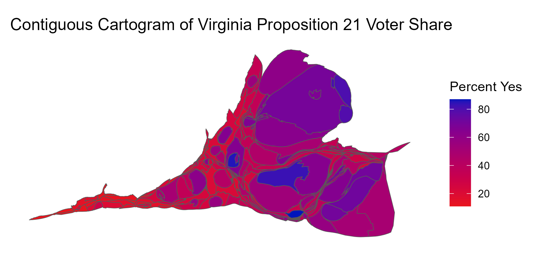
It turns out there are a number of ways to build cartograms. My first attempt is a contiguous cartogram that warps the shape of the counties. The larger the resulting county, the larger the population living in that county. If you’re following along at home, the function that builds the cartogram information can take a minute or two to run depending on the power of your computer.
Click to see R
virginia_wild <-cartogram_cont(virginia, weight ="population") |>#build cartogram informationleft_join(localresults, by =join_by(NAMELSAD == Locality)) #join to local resultsggplot(virginia_wild, aes(fill = percYes)) +geom_sf() +scale_fill_gradient(low="#E9141D", high="#0015BC") +labs(title ="Virginia County by Population", fill ="Percent Yes") +theme_minimal() +theme(panel.grid =element_blank())
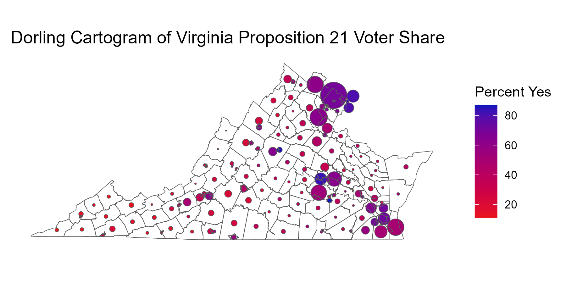
This is something of an improvement from my perspective. You get a better sense that the state is mostly purple, with a few big chunks of dark blue and some smaller rural counties. However, I still wasn’t entirely happy with the results of this. I don’t entirely love how badly the geography ends up being warped. I suspect there are other contexts where this doesn’t matter as much, but I think for the purposes of this demonstration I’d rather maintain the underlying geography. The next thing I tried was a Dorling cartogram, which turns the cartogram weight (population, in this case) into some sort of polygon, often a circle.
Click to see R
va_cart <-cartogram_dorling(virginia, weight ="population", k =1) |>#build the Dorling informationleft_join(localresults, by =join_by(NAMELSAD == Locality))ggplot(va_cart, aes(fill = percYes)) +geom_sf() +scale_fill_gradient(low ="#E9141D", high="#0015BC") +labs(title ="Dorling Cartogram of Virginia Prop 21", fill ="Percent Yes") +geom_sf(data = virginia, alpha =0.0, inherit.aes =FALSE) +# have to call again to get the outlines of the statestheme_minimal() +theme(panel.grid =element_blank(), axis.text.y =element_blank(), axis.text.x =element_blank())
I think this is an improvement, because it leaves the viewer with a better sense of the existing geography, and it’s possible to see roughly where the big population centers are. I think the biggest improvement would be to make this interactive, so you can mouse over a circle and see what county you’re dealing with, the total population, and specific proportion of votes that were yes or no.
Interactive Cartogram
There are a few different packages in R that will handle this, but I landed on plotly. I’ve played with it a little bit before, and it has pretty nice integration into ggplot2. You can actually turn an existing ggplot2 object into a plotly object using the function ggplotly. However, the function has to make some assumptions about how you want the final object to look, and it didn’t turn out excellently in the case of my visualization. Thankfully, there’s an online book about how to use the package and the mapping section had some example code that was almost exactly what I needed (specifically the code for Figure 4.14 at https://plotly-r.com/maps). Unlike ggplot2, I need to do some pre-processing of the gradient scale to get it to work properly, but it’s otherwise a pretty smooth experience. I also use a call to the cut_short_scale() function from the scales package to shorten the numbers to something more readable.
Click to see R
library(plotly)#pre-process voter percent to get the proper gradient#without alpha set to TRUE, I got much lighter colors than ggplotva_cart <- va_cart |>mutate(fill_color = scales::col_numeric(palette =c("#E9141D", "#000292"), domain =range(percYes, na.rm =TRUE), alpha =TRUE)(percYes))plot_ly(stroke =I("black"), span =I(1)) |>add_sf(data = virginia,type ="scatter", #If I don't set to "scatter" manually, Plotly just guesses this anywaycolor =I("white"),hoverinfo ="none" ) |>add_sf(data = va_cart,type ="scatter", color =~I(fill_color), #call the pre-processed gradientalpha =0.80, #Plotly's default alpha is much lower, doesn't match ggplot as wellsplit =~NAMELSAD, text =~paste0(NAMELSAD, "<br>", "Population: ", scales::number(population, scale_cut = scales::cut_short_scale(), accuracy =1),"<br>","Percent Yes: ", round(percYes, digits =2), "%"), hoverinfo ="text", hoveron ="fills" ) |>layout(title =list(text ="Interactive Virginia Prop 21 Cartogram", xanchor ="left", x =0, xref ="paper"), showlegend =FALSE)
 This is something of an improvement from my perspective. You get a better sense that the state is mostly purple, with a few big chunks of dark blue and some smaller rural counties. However, I still wasn’t entirely happy with the results of this. I don’t entirely love how badly the geography ends up being warped. I suspect there are other contexts where this doesn’t matter as much, but I think for the purposes of this demonstration I’d rather maintain the underlying geography. The next thing I tried was a Dorling cartogram, which turns the cartogram weight (population, in this case) into some sort of polygon, often a circle.
 I think this is an improvement, because it leaves the viewer with a better sense of the existing geography, and it’s possible to see roughly where the big population centers are. I think the biggest improvement would be to make this interactive, so you can mouse over a circle and see what county you’re dealing with, the total population, and specific proportion of votes that were yes or no.